Christmas cards

I was asked to illustrate and design 2 cards this year. One for Vickie Howell of DIY's "Knitty Gritty" and one for the production company Screen Door Entertainment.

click to enlarge image

A Christmas story

This post is about my new inspiration in the new year.

Last spring the family took a trip to Disneyland. At the end of a long day just after riding the "Pirates of the Carribean" my 3 year old niece Devin was grumpy and tired. She started crying. In desperation, I purchased a small bag of plastic jewels at the gift shop. I gave them to her telling a story that I stole them from the pirates and they were looking for me and could she hide them for me. It worked ...she smiled again. For the next half hour she would see pirates and we would have to hide behind anything available including trashcans.

On that day a world of play and imagination was created between Devin and I that I never expected. Since then we have....

-run from tree to tree hiding from pirates walking to the corner Starbucks for chocolate milk.
- seen pirates while out to dinner on family events.
-claimed her and her parent's room as "pirate free" in a very complicated and surreal pre-school ritual I could not understand.
-vanquished pirates hiding in the dryer and washing machine at my house.
-had numerous battles with pirates hiding upstairs in Grandma and Papa's house.
-searched for treasure in her backyard.

According to Devin, pirates can be anywhere ...on top of lamps, in drawers, inbetween books on a shelf or under chairs.

Sometimes when I visit, I'll surprise her with store bought toy jewels or craft store decor glass I claim is stolen treasure from the dread Pirates.

What is fun is that Devin herself in a random moment (sometimes weeks apart) yells "pirate!" and the game begins. It has always warmed me inside that we share a special game. Then came last Saturday night...at Grandma and Papa's... Christmas eve.

Devin's Mom; my sister Megan, proudly announced that Devin had personally picked out and wrapped her gifts to everyone herself with no help from Mom.

Devin handed me her gift. I had to smile because a one armed monkey with no thumbs while drunk could have wrapped better, but I knew it was, in Devin's mind a "Martha Stewart" wrapping masterpiece.

Devin smiled at me as I looked upon this mass of pretty paper all twisted and crumpled with a lone bow dangling from the end secure with 10-15 layers of tape.

Devin said ...

"Dave...this to fight Pirates and get treasure...and bring home to me."

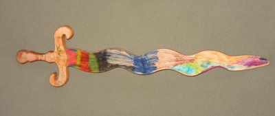
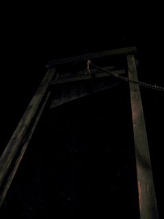
I unwrapped it and saw ...

Along with it's magic marker decor it had "runes" inscribed on it's hilt... my name and Devin's name in some ancient, backwards lettered language only spoken and understood by 3 year olds. I admit I started to tear up.
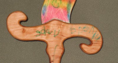
Megan explained they where at "jacklope" a unique and cool shop here in the Valley and Devin saw this wooden sword and wanted it for me.


Moments later Devin whispered to me...

"I saw pirates in Grandma and Papa's room!"

We went upstairs to once more battle pirates that Devin said were trying to steal Grandma's slippers... with my new sword at the ready!

No sword from the books of J.R.R. Tolkien is as powerfull, no sword since King Arthur's "excalibur" contains such magic.

This sword has reinforced what my Parents and family taught me but I have often forgotten; a single moment might define you in the mind of a person forever.

I will never forget... on that Christmas eve, I was a pirate slayer and treasure bringer to someone in this world.

Thank you Devin for reminding me to try and make my everyday choices and actions noble.

HGTV Outer Spaces portfolio 1 -kid's playspaces

As art director on HGTV's Outer Spaces (see "links") I had some amazing creative opportunities. None better than occasional make overs that needed a kid's play area.


click to enlarge pictures


Cartoons-Whole Foods

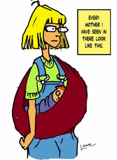
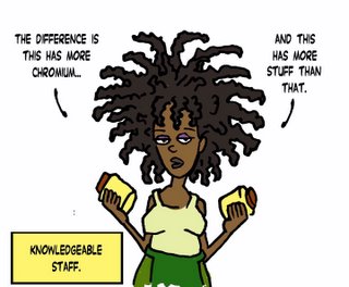
So I ventured into the popular "Whole Foods" yesterday. I don't know if this chain is exclusive to L.A. It's a regular supermarket except for more eco-friendly and healthier products.

Click to enlarge.

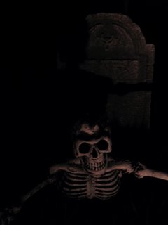
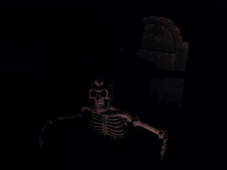
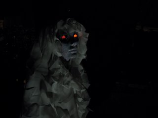
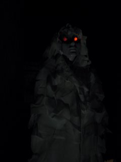
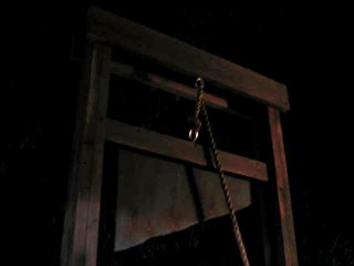
Halloween portfolio 2005

Click on pictures to enlarge.


I once read that Walt Disney would get on his knees to see Disneyland from a child's perspective. I do as well (insert evil laugh here)!


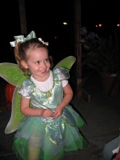
During the evening my niece Devin a.k.a. Tinkerbell arrives to brave the haunts. OK this picture has nothing to do with illustration or art direction, but come on....how cute is she!?

Knitty Gritty Fun

I am very flattered. My friend and co-worker Christine Jagalino just posted some cartoons I did for fun on the dry erase board outside the studio doors during Knitty Gritty on her blog; Friendshipnight.

These "how to" shows bring alot of stress for people like Christine, one of Knitty Gritty's show producers. The list of her job responsabilities is too long to post.

Christine always handled it with grace and calm.

I'm glad she found these cartoons enjoyable, I hoped to bring a little humor to our work days.

Jason

Jason Garner is an amazingly talented designer who I have had the pleasure of working with and to call a friend these past 3 years.

He began working for me on HGTV's "Outer Spaces" and I have tried to con him into helping me on almost every project since. Unfortunate for both of us many of the projects we have worked on together do not utilize his true talents...but you gotta pay the rent.

Everyday I am inspired by his dedication to detail and work ethic.

Jason is an incredible conceptual illustrator and I have no doubt will be discovered soon and be fought over by many a big wig for their productions.

Until then Jason earns his stripes day to day with me enjoying the glamour of working in the Art Dept. on the popular DIY show, Knitty Gritty.


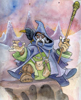
Old Wizard

click to enlarge

I am up way too late for someone who has to be at work at 7am. Late night thinking is always, for me...retrospective .

Tonight, I was thinking about how in the last few years all my "fan-boy" interests I loved as a kid like X-men, Spiderman, Batman, Lord of the Rings, etc. has now become mainstream and cool.

I 'm not sure when the flip between hip and dork occurred but I am a little bitter knowing it happened far too late for me.

So I decided to pull this old illustration out and finish up. I always liked this piece but felt it a little dated & "dorky" to make a portfolio piece so I abandoned it.

I'll post the finished work when done.

A Card for Devin

This was a quick 15 minute (chronic procrastinator) card illustration for and of my niece Devin with her pets. Another day of celebration for this much doted-upon member of the family.

Lost in Space portfolio

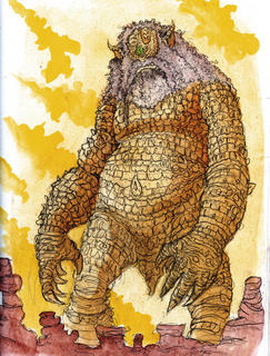
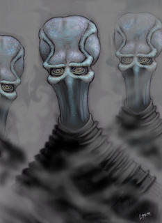
These designs were done for Vincent Guastini (see "links") as he was preparing a presentation for getting the creature/make up effects position on a John Woo directed/produced new t.v. production of the classic series. The designs are re imagined classic monsters from the original series and one new alien species that was to be the on going villians in the series. These designs did not make Guastini's final cut...but I liked.

Click on picture to enlarge


Evolution of a Set

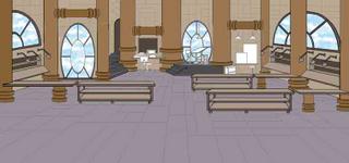
From a single t.v. show set topic - crafts, an idea forms. It is a small little microbe of a vision swimming amid a mass of day to day needs and responsibilities. One afternoon as the deadline approaches this small unformed microbe riggles it's way onto a sketchbook page. A simple shape, not even a thumbnail sketch, no details, just a random pencil line. Thus a set comes to life through "intelligent design".

Click on pictures to enlarge

The Timeline....

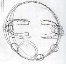
NO IDEA'S ERA

SETSKETCHUS WHATISITUS
This random pencil line, meaningless and unformed is a signed contract. As with any idea, once commited to my sketchbook page must be evolved and made whole.


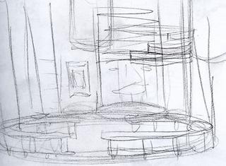
SETSKETCHUS KINDOFSOMETHINGUS
Here the pencil lines evolve more 3-d. They still have no direction. A sense of space forms but nothing defined, like vines in a garden looking for a surface to adhere too.


SETSKETCHUS MAYBESOMETHINGUS
Here the design tries to create an iconic set element to let everything else evolve from.


REAL CONCEPT ERA - 500 DOODLES LATER

SETSKETCHUS MOREDEFINEDUS

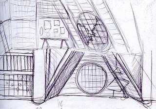
A solid vision of what the set could be has evolved. A concept is formed around what the practical needs of the set are. This sketch is presented as is with a creative verbal pitch to fill in the blanks. In concept the set is approved.


SETSKETCHUS THISCOULDBECOOLUS
With an approved theme, the set evolves into a self indulgent idea I have always wanted to do, a Jules Verne like workshop. This sketch is approved by the "in house" staff but viewed too "medievel" by the network. Sadly, before the verdict was announced a huge number of detailed sketches, ideas and doodles with enhanced details based on this concept where done that noone ever saw. Elements of the design are approved but I must lose metal finishes, steamline the harder edges and make more modern. Everyone loves the windows!


SETSKETCHUS REDOUS
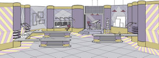
Here the design is streamlined by unifying the harder edged industrial elements like pipes and windows in size and shape. I drop un-needed elements like the staircase to nowhere and make the floorplan curved. I also pastel the colors. This revision is approved except I am to lose the windows. Now they hate the windows.


SETSKETCHUS NOWINDOWUS

I lose the windows except for 2 which I think give an iconic feel. I am told to lose them. I'm asked to add 1 more work area and make bigger for cameras and crew to get around.


FINAL DESIGN ERA - 1200 DOODLES LATER


SETSKETCHUS O.K.US
At somepoint after the previous sketch, the show was officially titled CRAFTLAB. Now my design is suddenly perfect, right on the money and excited about. It is streamlined more to reflect a retro laboratory feel. I am told to lose real worktables and make them more conceptual. This sketch outside of a few minor changes is approved for construction. I am however to hold on color till the network creates the opening graphics so the set and titles compliment.


SETSKETCHUS FINALUS
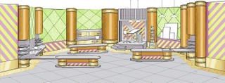
This sketch is based on the last conference call and viewing show graphics, it was decided the set colors should be bright and saturated .


2001 Oscars Governor's Ball

In 2001, party designer Edgar Zamora and his company Revelry Inc. asked me to design the chandeliers and table centerpieces for the 73rd annual Academy Award Governor's Ball held for the last time at the historic Shrine Auditorium in Los Angeles. The theme of the ball was Victorian; the time when the art of film began.
Each chandelier was 2' wide by 7' tall and contained a back lit, frosted, interior wall covered in applique' butterflies, which slowly rotated. Each table centerpiece was a working zoetrope - the original motion picture technology - and, at its base, was a beautiful floral arrangment by Mark's Garden. My sister Monica helped me create all 78 zoetropes and 8 chandeliers.


Click on pictures for larger version.