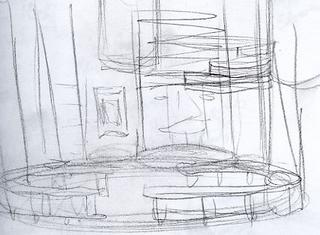
From a single t.v. show set topic - crafts, an idea forms. It is a small little microbe of a vision swimming amid a mass of day to day needs and responsibilities. One afternoon as the deadline approaches this small unformed microbe riggles it's way onto a sketchbook page. A simple shape, not even a thumbnail sketch, no details, just a random pencil line. Thus a set comes to life through "intelligent design".Click on pictures to enlargeThe Timeline....
NO IDEA'S ERA
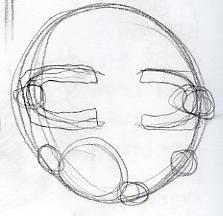
SETSKETCHUS WHATISITUSThis random pencil line, meaningless and unformed is a signed contract. As with any idea, once commited to my sketchbook page must be evolved and made whole.
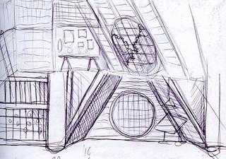
 SETSKETCHUS KINDOFSOMETHINGUSHere the pencil lines evolve more 3-d. They still have no direction. A sense of space forms but nothing defined, like vines in a garden looking for a surface to adhere too.
 SETSKETCHUS MAYBESOMETHINGUSHere the design tries to create an iconic set element to let everything else evolve from.

REAL CONCEPT ERA - 500 DOODLES LATER
SETSKETCHUS MOREDEFINEDUS
A solid vision of what the set could be has evolved. A concept is formed around what the practical needs of the set are. This sketch is presented as is with a creative verbal pitch to fill in the blanks. In concept the set is approved.
 SETSKETCHUS THISCOULDBECOOLUS
With an approved theme, the set evolves into a self indulgent idea I have always wanted to do, a Jules Verne like workshop. This sketch is approved by the "in house" staff but viewed too "medievel" by the network. Sadly, before the verdict was announced a huge number of detailed sketches, ideas and doodles with enhanced details based on this concept where done that noone ever saw. Elements of the design are approved but I must lose metal finishes, steamline the harder edges and make more modern. Everyone loves the windows!

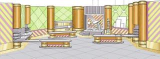
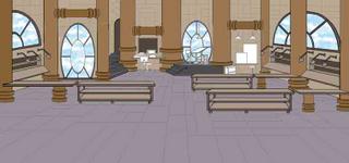
SETSKETCHUS REDOUSHere the design is streamlined by unifying the harder edged industrial elements like pipes and windows in size and shape. I drop un-needed elements like the staircase to nowhere and make the floorplan curved. I also pastel the colors. This revision is approved except I am to lose the windows. Now they hate the windows.

SETSKETCHUS NOWINDOWUSI lose the windows except for 2 which I think give an iconic feel. I am told to lose them. I'm asked to add 1 more work area and make bigger for cameras and crew to get around.
FINAL DESIGN ERA - 1200 DOODLES LATER
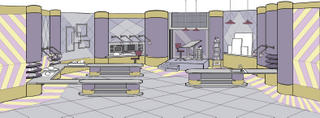
SETSKETCHUS O.K.USAt somepoint after the previous sketch, the show was officially titled CRAFTLAB. Now my design is suddenly perfect, right on the money and excited about. It is streamlined more to reflect a retro laboratory feel. I am told to lose real worktables and make them more conceptual. This sketch outside of a few minor changes is approved for construction. I am however to hold on color till the network creates the opening graphics so the set and titles compliment.
 SETSKETCHUS FINALUSThis sketch is based on the last conference call and viewing show graphics, it was decided the set colors should be bright and saturated .
