
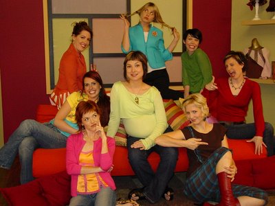
Stylelicious is a new show I designed the set for airing on the DIY network every Thursday at 11:30 am PST and 2:30pm EST. Stylelicious focuses on handmade wearable art projects for funky and fabulous creative people. It's hosts are rotating founding members of the Austin Craft Mafia .
Below is my first approach to the set, an artist's loft feel in true "how to" show set design style. Upon seeing this my executive producer gave me a direct order... "No brick!"
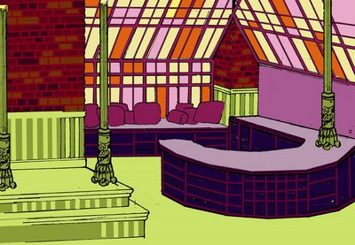
There's a good reason I and other designers go with loft themed sets for studio based "how to" shows. They have to be large spaces that give multiple cameras room to move easily, let demos be pre-set unseen in various locations and the lighting be consistant. A loft theme allows this and the wide open space still looks inviting and natural.
Almost every other "how to" show has a loft feel with brick (painted or bare) in the design and some variation of factory windows. I did know I was not thinking different but was very happy I had the O.K. to try and break the norm.
After a few meetings, the practical needs of the set were established. I researched the host's work and was leaning twords a retro feel. They all have thriving cottage industries and an artistic edge to their work that reflects their own lifestyles. My supervising producer suggested a "vintage" clothing store look to the set.
It was a good idea. I took a day or two visiting all I could find. After 15 or so different stores I noticed (atleast here in Los Angeles) none were any more different than a Salvation Army store with pretty paint on the walls. Nothing unique or inspiring in overall architecture and interior design.
However, It did cement my the strong retro inspired feelings as all the stores had it. I decided to approach the design with an old made new feel. I imagined a victorian home with elegance in architecture contrasted by unique and funky decor. To me this represented the Austin Craft Mafia's work...hip, artistic design with traditional handmade attention to detail and quality.
Below is a first attempt with the needs of the set in mind. I knew manniquins would be a important part of the show displaying finished work. I wanted "built in" alcoves to showcase. From here many idea's evolved. The overall look began to come together. The basic floorplan worked.

I wanted to have a general audience acceptable new fun look to the "demo" areas different from a traditional "how to" show. I proposed, although a little cliche... a hipster, cocktail culture bar and retro kitchen table area. These idea's were approved both "in house" and by the network.
Below is the first really tight design idea. You can see my wanted victorian elements.
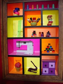
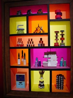
I pushed the bar idea further by putting supplies/tools in Mondrian influenced shelves framed as large art pieces to the left and right. I felt this would help sell it as a fun workspace and not just a cocktail bar. I also added a large iconic route 66 billboard art piece... no real reason... I thought it looked cool and gave a small nod to Austin, Texas.
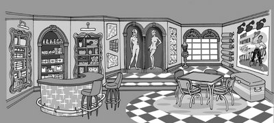
I started to think color from here.
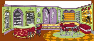
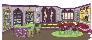
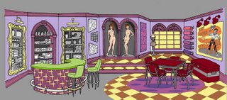
Knowing the "bar" area was approved I used it to explore various themes so I knew I left no stone unturned...
The 50's wood paneling family room concept.
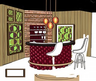
The Donny and Marie 70's Variety Hour concept.
 Here's a version with some of the of both with blatant Mondrian art colored shelves.
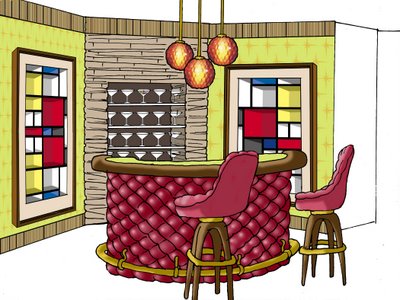
I also played with a "rock a billy" thing. Here's an Airsteam trailer inspired window with a Fridgadaire bookcase.
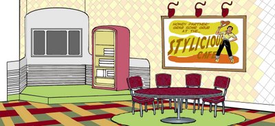
I went ahead and merged all my above random idea's into this proposal below. I knew it would not pass but you never know what other's might like. I had fun with my Tim Burtonesque diamond pattern on the wall.

With the overall layout of the set approved, I went ahead and did a down and dirty foamcore model of the design as I was still thinking out specific decor and color.
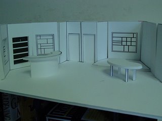
Although only 1/2 inch scale, taking pictures from potential camera positions helps me to imagine the set as it might be. It's always amazing just how accurate this is (provided I did my math right) and really helps to trouble shoot any problem issues early on.
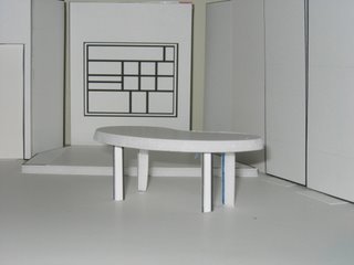
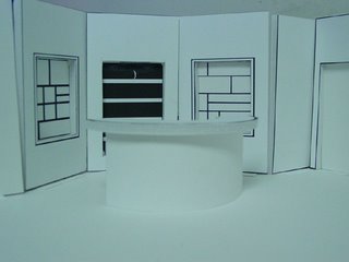
We now fast foward past many renderings, sketches, proposals, meetings, conference calls and e-mails. All concerned have opinions, notes and idea's...the director, lighting designer, hosts, network and production staff.
My artistic ego must be buried. This is the way it is on any production. On this project I was told "too distracting" in regards to ... the victorian detail, manniquin alcoves, the frames around the bar shelves and all idea's for patterns on wall or floor.
In the end the set becomes a amalgim of everyone's imput. It must also be within budget. The production manager often could care less what it looks like as long as it's cheap. Below is the approved final design.
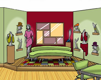

Plans are drafted and the building begins at The Scenic Route, a shop here in Los Angeles.
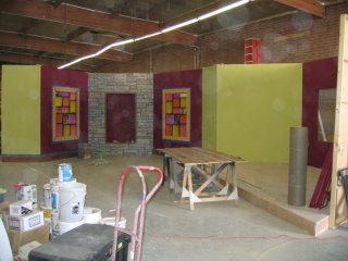
Below the construction is near done, but all work halts as the color and set is approved by producers while there is still time to make any changes. It's thought the green is too bright and then repainted a shade or two darker.
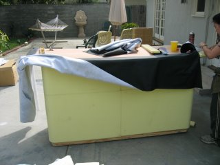
The budget is tight and a few set pieces must be made in my small garage workshop. Pictured below is my talented assistant art director and friend, Andri, upholstering the bar rail.
In the design process came a requested important set element - the style stash- a place where our hosts would spontaneously go to get materials when inspired during a project as scripted.
As drawn.
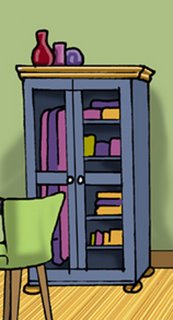
The before... an cheap IKEA item.
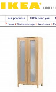 We added some moulding, gave it ornate hardware, replaced the plexi glass panels with wire mesh and painted it with a worn look in bright colors.
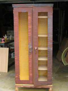
The after. Not too bad looking and under budget.
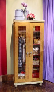
You'll see alot of IKEA stuff in all your favorite decorating shows, network dramas and major films. It's inexpensive and stylish. The Burbank store is also within fast driving distance from all the major studios in town. No matter how big budget the production, every dollar counts. I've even noticed a IKEA item in Disney's PIRATES OF THE CARRIBBEAN movie . No joke! Look carefully. I won't tell you where, but is easy to spot if your an IKEA shopping veteran.
Below are pictures of the finished set.
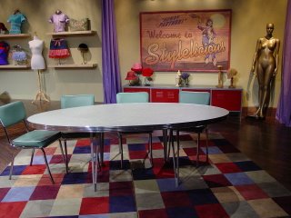
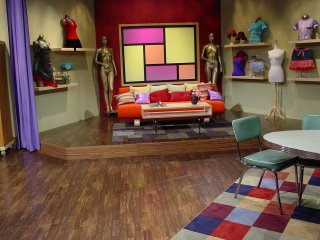
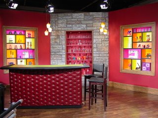

Set looks amazing! It takes me back to those early morning four-shot lattes, trying to get the ball rolling. Then, at the end of the day, around 10pm, they say "hey Dave, we think the walls should be a different color!?"
ReplyDelete"uh........ok. C'mon guys, let's get painting!"
Also, what happened to the Frigidaire bookshelf? That was the coolest.
ReplyDeleteDave,
ReplyDeleteThis is a great post! Having spent countless hours living on that particular set, it's awesome to read about the design process and how your ideas came into fruition. You're the best, Davey-cakes!
Hey, Not Another Teen Knitting Book is out now--your drawings look great!
Crafty Kisses,
Vic
I'm with Vickie, your set was quite a nice place to live. I want my own Stylelicious poster for my house. When is the blog about the Craft Lab set coming out? Keep me posted.
ReplyDeleteMiss you kids!
xo,
jen
i am amazed! fabulous job and this post was so intriguing!!! now i have to go back and watch all the episodes over and over again to soak u p every detail of the set!!!
ReplyDelete